Why Bright Casino Signs Can Still Leave You Lost
Bright casino signs can still confuse visitors. Learn how clear labels and well-placed cues make casino interiors easier to understand and navigate.
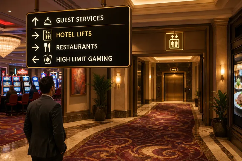
The common mistake with casino signs is treating brightness as a substitute for direction. A restaurant name may glow across the gaming floor, yet visitors can still miss its entrance, hesitate at a junction and double back.
Casino wayfinding works best when each sign has a clear job: identify a destination, offer a choice, or confirm that someone is on the right path. Keeping those roles distinct makes an interior easier to read without turning every wall into a directory.
Use bright signs to identify destinations, not routes
A striking restaurant sign helps visitors recognise the venue once they arrive. It does not explain which corridor leads there. At a junction, a concise arrow paired with the familiar destination name gives useful direction; the decorative lettering can do its work at the entrance.
Think about what a visitor needs at each point. Before a choice, show where to turn. At the destination, make the venue easy to recognise. After a turn, add a simple confirmation only if the route would otherwise feel uncertain.
Give each sign one clear reading task
A panel listing restaurants, toilets, lifts, gaming areas and exits at equal prominence asks visitors to scan everything while moving through a busy space. Group related destinations and make the options relevant to the immediate decision easiest to spot.
Use the same plain-language name for a destination throughout the building. If one sign says “Toilets” and another says “Washrooms”, a visitor may wonder whether they refer to the same facilities. A stable label removes that avoidable pause.
Position directions where a decision happens
A useful arrow is no help if it appears beyond the junction it describes. Check the view from each approach, including routes where a queue, canopy, display or column might hide the panel.
If visitors cannot see the information before choosing, move it to a clearer position or add a cue at the approach. A second sign is useful when it resolves a specific blind spot; it is clutter when it merely repeats information already visible.
Make the visual language easy to learn
Repeated destinations should keep familiar names and symbols. A lift icon that changes from panel to panel makes visitors work harder, while a colour that quietly changes meaning can undermine the whole scheme.
Colour can help distinguish zones, but it should support rather than replace words and recognisable symbols. That way, the message remains legible when lighting, distance or a visitor’s colour perception makes the hue less useful.
Which casino sign details deserve attention?
Should every destination have its own colour?
No. A small, steady colour system may help distinguish areas, but too many colours create another code to learn. Pair any colour cue with a clear label and familiar icon.
When should a sign confirm the route?
Use confirmation after a turn when the next direction is not obvious from the layout. If a clear landmark already makes the route plain, another arrow adds little.
What belongs on a directional panel?
Show the destinations that help visitors make the immediate choice, with related options grouped together. Leave secondary information for another point rather than giving every name equal weight.
How can a team spot a confusing junction?
Look at the space from the visitor’s approach and note whether the sign is visible, understandable and actionable before the route divides. If one of those conditions is missing, adjust the wording or position tied to that choice.
Work through one route without repeating the same checks
Say a visitor starts at the gaming floor and wants the hotel lift. The first panel gives “Guest Services” the largest lettering, while the next arrow points towards a lobby without a lift symbol. The visitor reaches the lobby but cannot identify the lift area. The team changes the first panel to direct visitors towards “Hotel Lifts” and adds a lift icon at the lobby entrance; the expected visible result is a clear choice at the gaming floor and an identifiable lift area on arrival.
For a focused review, choose a starting point and write down the destination and every place the route divides. At each division, record the wording a visitor sees and the action it suggests. If the wording does not identify the intended destination, revise that label; if the information is hidden, relocate or supplement the cue; if the direction is clear, leave it alone.
- Destination name: Check whether the same name appears from the starting point to arrival. If it changes, standardise the label; if it stays stable, keep it.
- Arrow direction: Check whether each arrow points towards the intended corridor or doorway. If it does not, correct the arrow or its placement; if it does, retain it.
- Timing: Check whether a visitor can read the direction before reaching the junction. If not, move the cue to the approach; if so, avoid adding an early duplicate.
- Visibility: Check whether a queue, column, canopy or display blocks the panel from the route. If it does, clear the sightline or reposition the sign; if it does not, leave the surrounding layout unchanged.
- Destination recognition: Check whether the entrance is identifiable on arrival. If it is not, strengthen its name or symbol; if it is, avoid extra decoration that adds no clarity.
- Route confirmation: Check whether the next direction remains uncertain after a turn. If it does, add a confirming cue; if a clear landmark settles the question, skip the extra sign.
Not worth the effort: adding a brighter feature to mask a muddled junction. Visual drama can draw the eye without helping anyone choose. Fix the specific label, arrow or sightline that causes hesitation, then let the lighting support that decision.
One final detail matters: signs cannot compensate for a route that contradicts what they promise. If an arrow points to a door that is routinely closed or a corridor that leads elsewhere, correct the route or its directions together so the visitor’s next choice matches the sign.